
Hey Trader,
Your candlestick shows price. Volume sits in a separate panel underneath.
That split makes you read the chart twice.
You process price, then process volume, then decide.
The lag costs money.
A breakout on thin participation looks identical to a breakout on heavy participation until you drop your eyes to the histogram. By then the candle has closed.
I pulled up GAP this morning.
Volume exploded on the earnings session, then fell to a death knell days later.
The price candles never warned you that participation had walked out.
But there is a chart that did…a chart type that puts price and volume inside the same box.
It’s called an Equivolume chart.
Richard Arms built it. He also built the TRIN and the tick sitting on your platform right now.
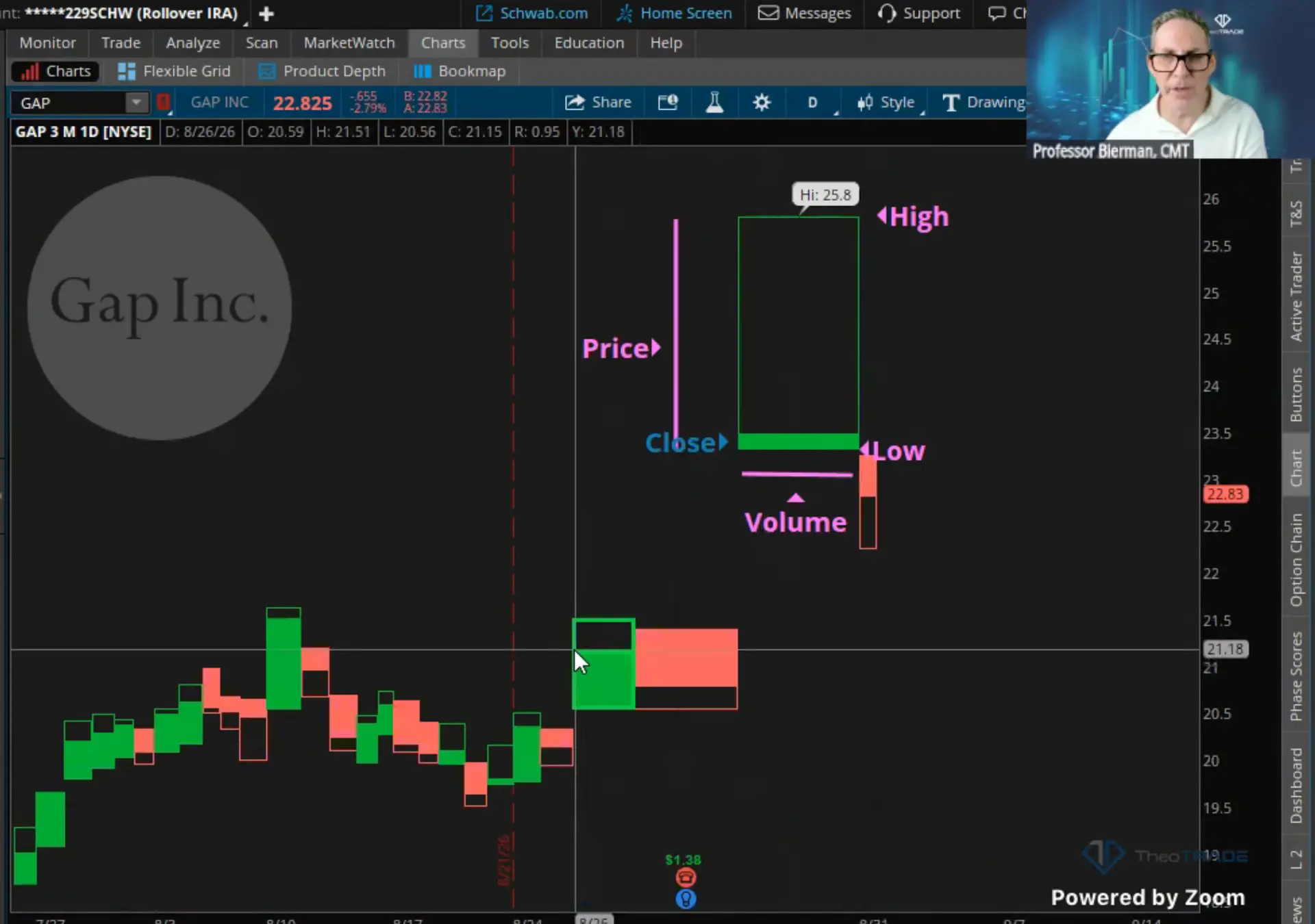
The height of the box gives you the range. The width gives you the volume. The color and the line inside give you the close.
That’s four readings in one shape.
I’ll walk you through each one below on the Gap chart.
The Chart That Merges Price And Volume
Richard Arms Jr. built the Arms Index that you know as the TRIN. He built the tick sitting in the corner of your platform.
He also built something almost nobody uses.
He introduced Equivolume in his book “Volume Cycles In The Stock Market,” where he gave it two or three full chapters.
Arms was a Wyckoffian. He died in March of 2018 at 83 years old, and technical analysis still runs on his volume work.
An Equivolume chart merges price and volume into one visual element for each period.
It keys off your frequency. A daily chart gives you one box per day, and an hourly chart gives you one box per hour.
Arms never designed this for intraday work. Plenty of people use it that way anyway, and I won’t cast aspersions if it hands you an edge.
What The Box Is Actually Telling You
Equivolume charts have no wicks. Every period is a box or a rectangle, and the body is the whole candle.
Stop hunting for a doji. Stop hunting for an engulfing pattern or a Marubozu, because they don’t exist here.
Four readings sit inside that single box, and each one comes from a different dimension of the shape:
- Height gives you the high and the low. Tall boxes mean higher volatility, and short boxes mean a quiet session.
- Width gives you volume. Wide boxes mean order flow and FOMO, thin boxes mean illiquidity and no institutional interest.
- Color gives you direction against the prior close. Green closed above the previous close, red closed below it.
- The horizontal line inside gives you the close. A close near the high shows buyer control, and a close near the low shows sellers in charge.
Color has nothing to do with a higher high. It comes from where the period closed against the last close.
That design eliminates the volume histogram. You can delete the subgraph, because the volume already lives inside the price.
Traditional candlesticks carry 108 combinations. This carries one or two.
How It Read Gap This Week
I still own some Gap. I sold a lot of it, and the Equivolume chart shows you why the tape changed on me.
Gap posted blowout earnings. Volume came in huge on that session, then dropped to a death knell right after.
On a candlestick chart that collapse hides in a panel below the price. On the Equivolume chart the boxes simply go thin.
The structure reads cleanly too. I can point to a double top, a pullback, a consolidation, and overhead resistance sitting exactly where the volume concentrated.
Watch 23.33 on that chart. The stock broke underneath the level, so it reset as resistance.
If Gap takes 23.33 back out, that resistance converts into new support. Volume-weighted boxes make the flip obvious.
How To Put It On Your Screen Tomorrow
The switch takes one click. Go to Chart Type and select Equivolume, and your candles convert automatically.
Then clean up behind it. Uncheck the volume subgraph, because the width already carries that information.
Change your MACD to the volume-weighted MACD. Those two work hand in hand, and a standard MACD leaves you desynchronized.
Now draw your levels. Horizontal supply and demand come easier on these boxes, and wedges, channels, and V-shaped patterns get easier to pinpoint.
Wide boxes on a breakout confirm real participation. Narrow boxes on a breakout tell you the move has no fuel behind it.
I run 12 study suites and I only add to them when something earns the space. Most of my charts carry four indicators total.
This one collapses three indicators into a single box.
You don’t fix a lagging read by stacking more indicators. You fix it by putting the volume inside the price.
I’m giving this the entire week. If you want the full framework behind how I read participation, momentum, and money flow as one picture, the Genesis COG System lays out the complete methodology.
Professor Jeffrey Bierman
Creator of the Genesis COG System