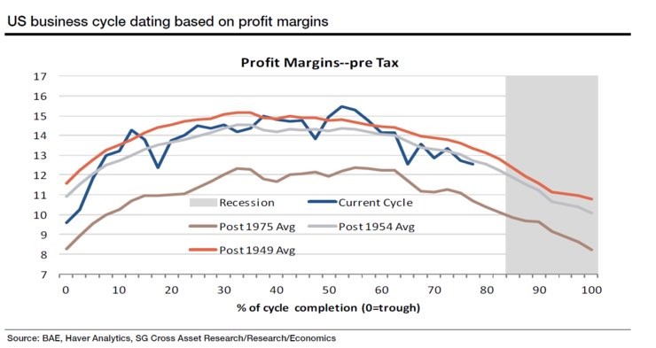
The chart below is interesting because it appears that profit margins are near their current peak. I expect Q3 margins to be down, but that’s only because of hurricane related weakness. My inkling is that the numbers here might be different because they are pre-tax margins. The stats I look at are all after taxes. On the one hand, tax shenanigans shouldn’t misdirect analysis of corporate profits. On the other hand, if taxes are cut in the next few months, profits will benefit making this chart null and void. Assuming taxes aren’t cut, this chart puts the economy close to a recession. If you assume we’re at peak margins, that puts off a recession for a year or two.
In a previous article we discussed how many asset classes such as bonds, stocks, and currencies have had very low volatility. The table below looks at different asset classes’ valuations. As you can see, when you combine a few metrics, stocks are in the 88th percentile in terms of valuation. The real treasury yield is closer to its average price than the nominal treasury yield because inflation is so low. Both high yield debt and investment grade debt are more expensive than average. High yield debt is extremely overbought because investors are looking for an alternative to stocks. Anything with high risk is on fire even if it doesn’t offer much return. Stocks which have high multiples appear like they’re fully priced, but they continue to move higher, so maybe our perception of what is fully valued is wrong. The other possibility is speculation has gotten excessive.

The chart below breaks down the credit spreads by rating. To be clear, triple B is the best on this list and triple C is junk. It’s also worth noting that the percentiles are the opposite as the table below. The lower the percentile, the more expensive the asset is. The reason for that is lower spreads mean yield differences are lower. This means investors don’t generate much more return for the extra default risk they are taking by buying low rated debt. Surprisingly, double B is the most expensive while triple C is the least expensive. I say it’s surprising because in this risk on environment, you’d expect the worst rated bonds to do the best. Junk bonds are performing well, but on a historical scale they’re only in the high 30s percentile.
It’s interesting to see that there have been two spurts where spreads tightened in this cycle without triggering a recession. That’s to be expected because of how long this expansion cycle has been. European issues may have caused the 2012 weakness and the energy crisis caused the 2016 weakness. The other interesting aspect is how the ratings have diverged. This could be caused by energy as that sector has a lot of firms in the junk bond market. Maybe investors don’t trust these firms to do well with oil in the low $50s. It seems like the periods of large divergence snap back quickly. The main point this chart aims to show is that buying some debt such as double B doesn’t offer much upside since its spread is in the low teens percentile.

In the table above, we saw that stock valuations are in the 88th percentile while bond valuations are in the 84thpercentile. These numbers are different from the chart above because they are valuations, not spreads. If you just look at the high yield portion of bonds, they are in the 90th percentile which is higher than stocks. It’s difficult to see for some people because fixed income doesn’t get the amount of press coverage stocks get. When the Dow hits an all time high, the headlines roar even though it’s relatively meaningless for the overall economy. The chart below attempts to compare junk bonds to stocks. The growth adjusted earnings yield for the S&P 500 is higher than junk corporate bond yields. As you can see, this valuation metric has done a great job of predicting relative returns as the black line is correlated with the gold line.

Just because high yield bonds are more expensive than stocks doesn’t mean stocks are cheap. I am always looking at different ways to value the market. Usually, I find weird indicators that aren’t relevant when on this search because it’s tough to get better than the tried and true methods. The chart below shows a metric I had never seen. It’s called the price to fantasy ratio. It measures the price to earnings ratio on earnings estimates in 2 years. The data in this chart takes the estimates 2 years after the first week in October. As you can see, the stock market PE is 15.9 for earnings in 2019. That’s the highest ratio going back to 2005. This is evidence that the money managers who said we are in a Goldilocks scenario are matching their answers in the survey with actions in their portfolios.
This excessive valuation based on 2019 earnings imply that either investors think earnings estimates are too conservative compared to past estimates or that the low inflation and high growth scenario will continue. Usually earnings estimates fall as we get closer to the actual reporting period, so investors are expecting that trend to end. The main takeaway from this chart is what we already know- stocks are relatively expensive compared to historical precedent. I wish this chart would go back longer, but there might not be data on earnings expectations two years in advance in the 1990s.

Conclusion
These are intriguing ways to look at valuations. Most bulls know that stocks and high yield bonds are expensive, but that doesn’t make them sell. Even the term ‘value investing’ is being criticized as a way to miss out on gains. This just shows how much froth there is in the market. That doesn’t imply a correction is coming because the economy looks sound and Q4 earnings estimates haven’t dipped substantially yet. I think it’s important to be a little more cautious than most bulls are. The point of value investing is to be patient. It’s easy to criticize this method before the events that make it fruitful occur.
Recent Comments