Record Highs On Tuesday
The stock market played to this year’s theme on Tuesday as the S&P 500 hit 2,600 for the first time, rallying 0.65%. The Dow had its 60th record high of the year which is 4th most records since 1910. The Russell 2000 rose 1.03% and the VIX fell 8.64% to 9.73. Tech led the market as the S&P 500 tech sector was up 1.16%. The chart below is an elongated historical measurement of advisor sentiment. As you can see, the bullishness was only higher 3 periods in the 1980s. That’s what happens when volatility stays sedated for an entire year.

Lack Of Tech Pulling Down MSCI Europe
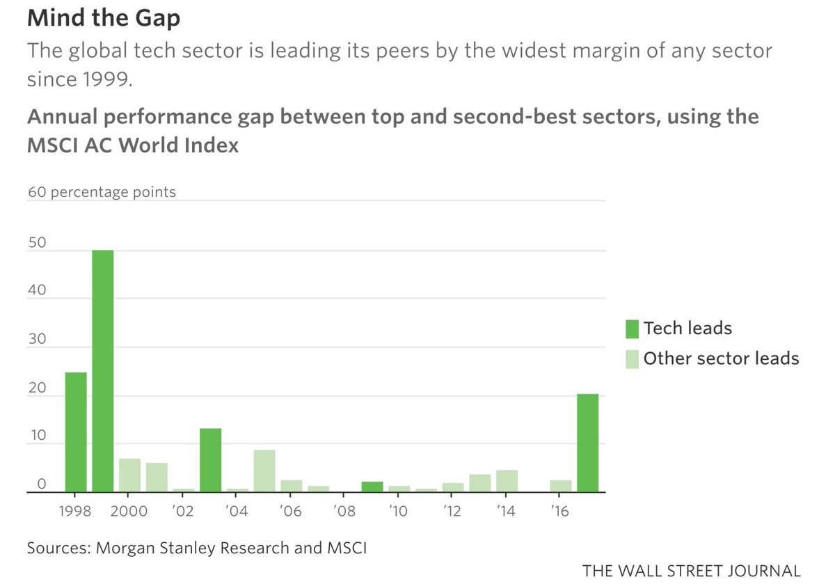
Tech didn’t just have a good day, it has had a great year. As you can see in the chart below, the tech sector has had the biggest outperformance gap of any sector since 1999. The sector is the leader of the new economy based on the internet. It is being helped by the low inflation rate. Technology’s outperformance is creating interesting performance gaps. Any index which has a lot of tech is doing well and any index which doesn’t have much tech is underperforming. The most noteworthy index which doesn’t have a lot of tech is the MSCI Europe index which has a less than 5% tech weighting which is below the MSCI World index which has a 17% weighting, the MSCI USA index which has a 25% weighting, and the MSCI Asia index which has a 28% weighting. Many tech stocks in Europe are expensive because investors want to buy tech, but there aren’t many stocks which meet investors’ needs. MSCI Europe underperformed MSCI World from 2013 to 2016. This year MSCI Europe is doing 3.64% better than MSCI World as of October 31st.
Another Ominous Chart
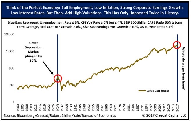
From the report with the comparison of this market to the 1920s, there’s another ominous chart forecasting doom and gloom. The chart shows the two times in history when the economy was ‘perfect.’ The only times the unemployment rate was low, inflation was positive but low, stocks were expensive, real GDP growth was positive, S&P 500 earnings growth was in the double digits, and the 10 year yield was below 4% were 1929 and 2017. The debate is whether the author of this chart tried to find similarities with times before crashes or if the economy just happens to be in the same state as 1929. One big difference between that period and now is that there aren’t world wars sandwiching this bull market. I think this comparison is more representative of how great things are than a bad forecast because these metrics will need to go sour to catalyze a crash.
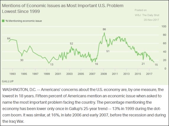
Supporting the notion that the economy is ‘perfect’ is the Gallup poll below. As you can see, the mentions of economic issues being the most important are near the lows seen before the financial crisis and the bursting of the dot com bubble. It’s especially interesting to see this issue so low on the totem poll because America isn’t at war. One of the reasons for this low concern is the low U6 unemployment rate. The current U6 rate is at 7.9%. The trough before the financial crisis was 7.9% and the trough before the recession in 2001 was 6.8%. These line up well with optimism. Americans aren’t economic experts. If they have a job, then the economy is great; if they are jobless, the economy is a top issue.
Bulls Fight Back
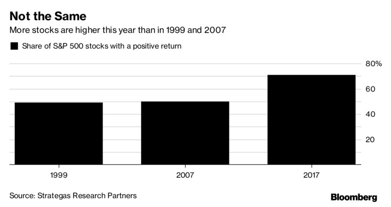
On the opposite side of the spectrum, the bulls have counter arguments which show this market is different from bubbles of the past. As you can see from the chart below, the breadth the market has in 2017 is much better than in 1999 and 2007. Market technicians believe when the breadth narrows it means only a small part of the economy is doing well. In 1999 it was tech stocks that led the charge and in 2007 it was the agriculture and energy names which were powering the market higher. Even though the FANGS are proclaimed to be the only winners of this market, that’s a function of the media trying to find a story more that reality. With over 70% of the market up in 2017, it has great breadth, signaling a crash isn’t near. Everything could change suddenly, but the action isn’t like the other tops in that regard.
Is 2017 Like Other Years?
I think it’s good to see some bullish charts which counter the comparisons of doom ad gloom. There will always be similarities and differences with every market. The biggest mistake investors can make is assuming this period of calmness means a disaster is ahead. Markets aren’t like the weather where there is a calm before a storm. 2018 can be another fine year. I think it won’t be as great as 2017, but there are few economic indicators or corporate indicators which show doom on the horizon.
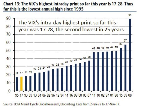
To put a bow on the summary of 2017, the chart below shows a list of the past 25 years’ peak VIX prints. As you can see, the peak print this year was 17.28 this year, which was the lowest peak besides the one in 1995. The stock market did well after the other years with low peaks, but I wouldn’t draw any conclusions from that.
Conclusion
As we approach the end of the year, it’s fun to take stock in what happened. With 60 record closes, the Dow is 10 closes shy of breaking the record for all time highs in a year. It has already been a quiet year with great performances. That would be icing on the cake. Optimism is high and volatility is low. The action next year will tell us if that was an ominous warning or if the economic growth in emerging markets has follow through. I will be focused on doing articles on this topic to make sure you’re up to date on the latest metrics.
Recent Comments