Single Family Housing Not Available
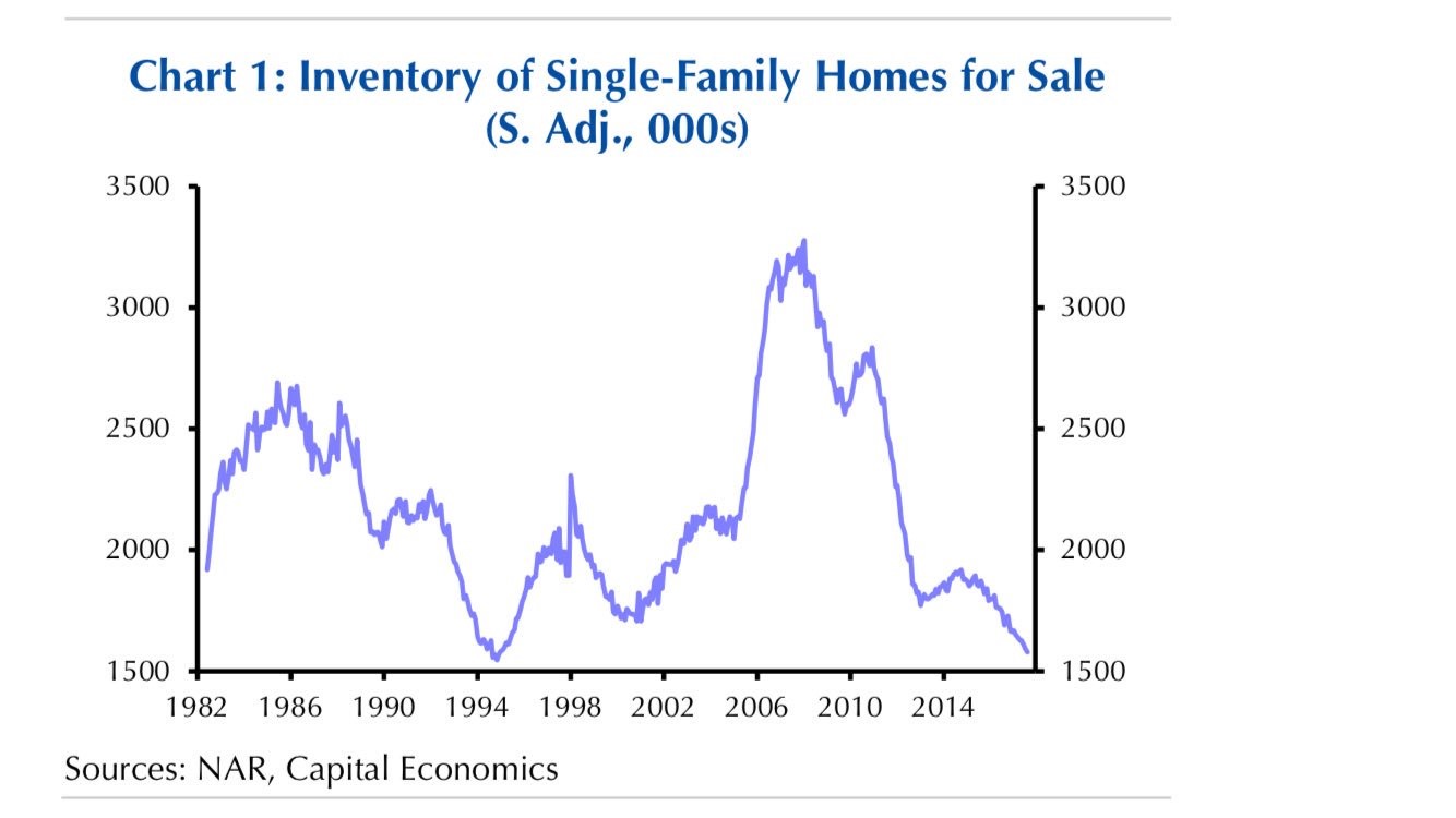
In previous articles, I have been discussing the lack of construction of single family homes which is causing prices to increase. The chart below shows the inventory of single family homes for sale on a seasonally adjusted basis. As you can see, inventory levels are the lowest since 1994. This is a sharp reversal from the early 2000s where inventory skyrocketed. That was an early warning sign that the housing market was in trouble. Part of the reason why houses aren’t being built is zoning laws. That being said, you’d expect the price responses to cause more building. The weak housing starts cause a drag on GDP growth. The high housing prices cause discretionary income for consumers to drop. Supply issues sound like a good problem to have, but it’d be better if more single family homes were built.
The chart below shows this dynamic in action as the private residential construction spending index for single family homes hasn’t rebounded close to the levels seen during the housing bubble. The spending on home improvements has rebounded nicely. Because Amazon - AMZN hasn’t been able to dominate the industry yet, home improvement retailers have been doing well. Multifamily housing construction spending has rebounded past the previous cycle high, making up for the weakness in single family spending.

Chinese Government Focused On Politics
As I have discussed previously, the Chinese government is undergoing changes this week as the 19th National Congress of the Communist Party takes power. The chart below shows the mentions on party Congress reports for the terms politics and the party as well as economy, market, and reform. As you can see, politics and the party saw an increase in usage while economy, market, and reform saw less mentions. This could be bad news for China in the long run as it might mean the country’s leadership has moved its attention away from allowing more competition to enter the country. Historically, when China allows market forces to enter it, the economy accelerates. The other possibility for this chart is economics weren’t discussed as much because the Chinese economy has stabilized this year.

The Market Is Exceedingly Calm
Let’s review some potentially bearish charts to get a better idea of what could go wrong in the market. If you’re bullish, you should spend most of your time focused on what can go wrong in the market and vice versa. The current situation where inflation is low and earnings growth is solid means stock performance should be where it is- up significantly. What’s unusual is the fact that volatility has almost ceased to exist. While stocks should go up, is it fair to say that now is the calmest period since the 1960s? That’s a tough analysis to quantify because many factors effect stocks. In this market it doesn’t even seem to matter when political issues arise or poor economic data is released.
While I’m not saying stocks should enter a bear market when a few bad results come out, the fact that there’s no reaction at all is disconcerting. I usually don’t like to look at anecdotes, but many participants who have been watching the market for decades have never seen such action. We’re now 3 days away from breaking the record streak for the longest period without a 3% correction. The chart below does a great job of quantifying what seasoned market watchers are saying. It shows the number of consecutive days 21 day realized volatility close to close has been below 10%. The streak is now above 200 days. That’s the longest streak since 1965. As I always say, as a long term investor volatility stats don’t matter much to me, but when streaks reach records, it’s worth paying attention. It’s possible that this is a meaningless quirk in the market; the other possibility is this calmness ends in a violent correction. In this bull market, we’ve seen calm periods followed by more calmness.

Comparing the way the market works now to the 1960s is like comparing hockey players of today to when goalies didn’t wear masks. Technology has made acquiring information instantaneous. Markets react to news quicker than a human can process the information. Therefore, it’s worth looking at charts which use more recent data. The chart below looks at the volatility in global currencies, treasuries, and stocks in the past 10 years. As you can see, they are all trending towards zero. It’s not only equities that are seeing quiet action. We won’t know if this is a secular change or if it’s just cyclical. Will the next recession bring life to the markets or will volatility spike less than previous bear markets?

Are Valuations At A Record High?
No bearish thesis would complete without discussing valuations. Some bulls think valuations don’t matter anymore because they haven’t mattered for the past few years. I think that’s mainly hubris. Whether valuations have been high for the past few years depends on which data you use. The Shiller PE has been above average this whole cycle, but it only started reaching nosebleed levels in the past two years as it closes in on the peak seen before the Great Depression. The chart below is the type of chart bulls scoff at as it has stocks being the most expensive ever. The peak PEG ratio is the price to peak earnings ratio adjusted for long run trend growth. It uses the peak earnings unlike the 10 year average used in the Shiller PE.
Some criticize the Shiller PE because it uses weak years which sandbag the results. In 2 years, the 10 year Shiller PE will stop including the crisis period’s earnings which will move the multiple lower. The peak PEG utilizes the top two quarters of earnings and adjusts them for GDP growth. One issue with this indicator might be that the long run GDP growth isn’t 100% correlated with profit growth. 30% of S&P 500 sales come from outside America. The majority of tech sales come from abroad. Therefore, one can argue this chart is ineffective as profit growth can exceed GDP growth. The reason I show it is to present the argument the bears are making.

Recent Comments